


As head judge on BBC’s Interior Design Masters, Michelle Ogundehin warned there are a few design details that “make a home look seriously dated”.
“I see all these tired trends again and again,” the interior design expert said, exasperated. “Which means you probably have no idea of the bad impression they send out.”
There are interior features that need to be thrown out for good, said Michelle, such as the term “pop of colour”.
Michelle explained: “I hate this phrase to the point that it makes my hair curl. I don’t know when it started but I hear it a lot today, as if it’s the salve to all decorative problems. It’s not.”
In an article penned to the Daily Mail, Michelle elaborated, stating that there should be a sense of flow throughout the home and not sudden pops of colour that look jarring.
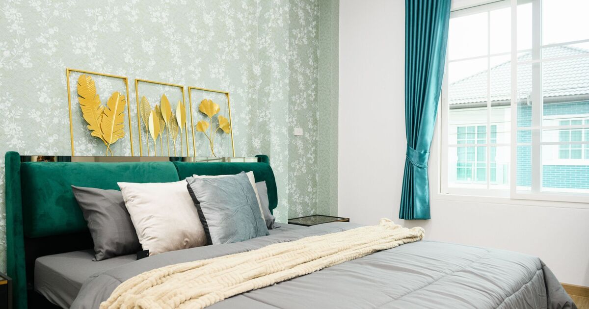
Michelle is also against distasteful feature walls and alcoves, preferring to colour drench a room.
Colour drenching a room means painting the wall, skirting board – and sometimes the ceiling – in the same colour.
“Whether colour or paper, whatever you choose has to cover more than one wall, preferably a minimum of three,” said Michelle – and the ceiling counts as a wall.
Michelle is also not a fan of carpet everywhere in the home – it should be reserved for bedrooms and stairs, and nowhere else.
The colour grey is a no-no, which has seemingly taken over homes in the past decade.
Michelle said: “It’s just a newer version of bland. A non-colour. It’s wildly unflattering. On walls, it drains the energy from a room.”
All pictures, including children’s drawings on the walls, need to be framed to look stylish. “Wood or metal frames only though please,” Michelle pleaded.
This may sound controversial, but Michelle isn’t a fan of open-plan layouts either. “These are draughty, dusty and tricky to decorate.”
Having cushions with the same material, colour and texture can look rather dull – “and woe betide you if you karate chop them in the middle like a fabric fortune cookie”.
Michelle said: “Cushions are a chance to indulge in the wonder of print and pattern, texture and tactility. Use everything from a wool bouclé to embroidered velvets, trim with tassels and ribbons and mix and match linen, satins and silks.”
Michelle recommended sticking to one palette of shades, four at maxium, and to vary these only by intensity of hue.
“In other words, if one of your colours is pink, you could use pale rose through to fuchsia, whether patterned or plain,” she said.
Tired trends making your home look dated:
- Pops of random colour
- Feature walls
- Carpet everywhere
- Grey walls
- Unframed pictures
- Matching cushions